Finding Serenity
As a provider of outdoor, man-made lakes, streams, natural pools and water features, Waters Edge’s primary marketing vehicle was an outdated web site that was difficult to navigate and featured great photography of its portfolio projects, but were presented in a way that didn’t do them justice.
Sometimes going to the lake isn’t enough. It’s then that the lake comes to you.

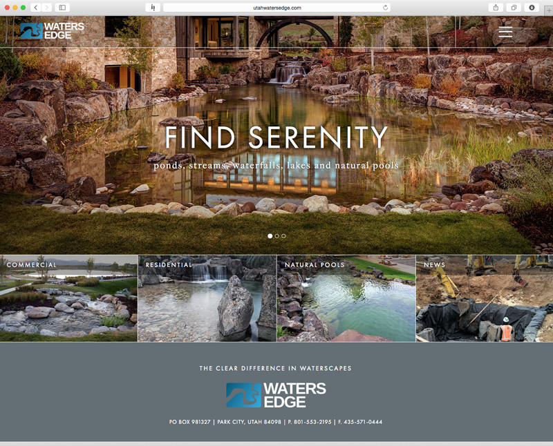
Landing Page of Waters Edge Site Featuring a Carousel of Portfolio Images and Vivid Project Categorization
Once engaged to develop a new web site, Serfwerks’ primary objective was to develop a site that adequately portrayed the serenity and beauty of Waters Edge’s work. With a foundational reliance upon portfolio photography, the design uses minimalist copy only to reinforce the message of the photography. The portfolio of the projects headlines the site, becoming a treat to explore.

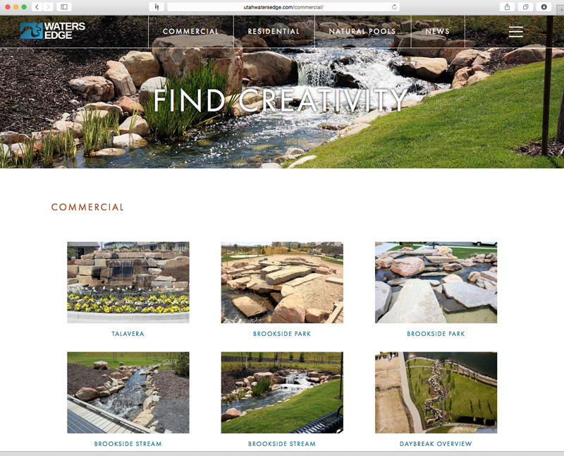
Secondary Page of Waters Edge Web Site
The secondary pages let the work speak for itself by featuring a visual listing of projects that open to a gallery of the Waters Edge projects. Headlines communicate the communion with nature found when experiencing the water feature.

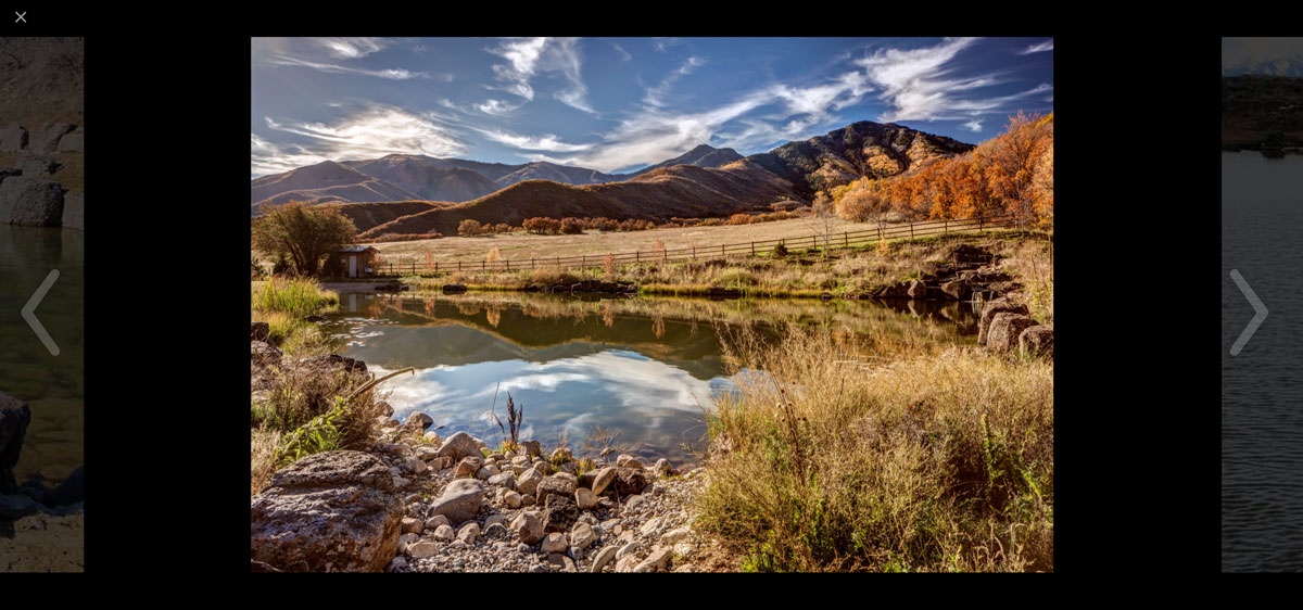
Gallery of Water Projects as Shown on Web Site
The web site’s galleries create a rich visual experience.
